D3 Tutorial for Beginners

This tutorial is based on a video from freecodecamp created by Curran Kelleher (you can find the it here). It is a great video covering the basic of D3.js. And this article is basically a written version of it for future reference, as I normally don’t like to re-learn something with video.
I will only cover the first part of the, making the a bar chart, so that I can focus more on the basic function provided by D3.js and composing the basic elements that are essential to every chart, like ticks and format.
Table of Content
- Basic of svg
- SVG with d3
- Loading Data
- Data, Shape and Enter, Exit
- Scaling in d3
- Creating x-axis and y-axis
Baisc of SVG
Unlike the other library, which provide you a pre-made chart and you plug in the data, D3 create the svg based on your own definition, and let you style it anyway you want. So it is much freer.
With that said, to fully utilise D3, you need to understand svg first. MDN has a good tutorial that introduce what you need to know. The video linked above also has a nice introduction and code alone exercise.
Here is some basic:
- basic shapes (e.g. rect, circle, line) and path
- grouping shape with g tag
- styling with normal css and svg specific still like fill
SVG with d3.js
To create a svg shape with d3.js, there are few basic function:
- select()/create()
- .append()
- .attr()

Loading Data
The D3.js library provide methods for processing data with common format, like csv, json and xml
Here you will find the documentation of it. I am not gonna go through the detail
Data, Shape and Enter, Exit
To map data to chart, we basically following these two patterns.
Scenario 1 — selected elements fewer than number of data:

- selectAll() select the elements that need to updated
- data() defined the update selection (number of data)
- enter() identitfies number of element that need to be added to DOM (number of data number of minus elements selected by selectAll())
- append() add the elements
Scenario 2 — selected Element more than number of data
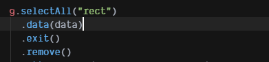
In oppose to enter() and append(), exit() and remove() are used when there is more rectangle (in this example) than the number of data. So by calling exit(), it identify the number of element that need to be removed.
It call be summerize as the following graph:

This is how we update a graph in d3, adding and removing elements in DOM.
Scaling in D3
In a chart, you need to know the scale of your data, like min, max, median, so that you can plot your data correctly. D3 provide different function to compute the scale for you. The most common are linear for quantitative and band for ordinal data.
The basic form are like this:

What is doman and range?
Domain is (usually) actual span of your dataset.
Range is the representative span of your dataset on the screen.
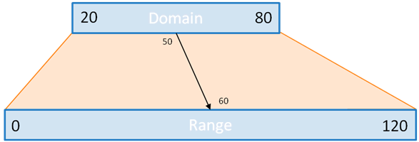
And your dataset will be plotted on the graph according to the scale of your domain and range.
By far, you should be able to create a graph like this.

Creating x-axis and y-axis
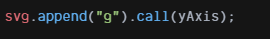
There are basically 4 functions to create the x-axis and y-axis, depending where you want to be positioned. axisLeft, axisBottom, axisRight and axisTop are the four you need.

To use it, just pass the scale you previously created. Then append it to svg.
This is basically how you create a graph with d3.js.
Create a scale, enter the data and remove the extra shape, then create axis for it.
